4

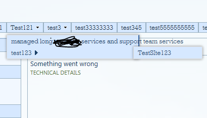
I have made the borders visible for the top navigation menu items. When the size of the text is not long the text appears to be fitting the menu drop box, However when the size increase of the text, it goes outside the box as shown below in the image. Requirement is not to break words.

enter image description here

Requirement is not to break words.

Edit 1

Below is the screenshot result tried out from Mihail's Answer.

The border of the box still does not stretch to the text size. Seems like with just plane css is it difficult to accomplish it. I believe may be css with jquery might be one option. enter image description here

5
  • Use word-wrap:break-word
    – Akhoy
    Commented Apr 5, 2016 at 16:44
  • Thanjs Akhoy..Requirement is not to break words
    – SandeshR
    Commented Apr 5, 2016 at 16:58
  • can you post the code?
    – Keerthi
    Commented Apr 7, 2016 at 21:12
  • have you tried to float it? Commented Apr 11, 2016 at 12:53
  • Can you check whether the wrapper for that drop down has a fixed width? You could try overriding/removing that.
    – Ava
    Commented Apr 12, 2016 at 15:53

3 Answers 3

5
+150

To fix the problem with the text getting out of the box, use the following solution:

ul.dynamic {  
  width: auto !important;
  white-space: nowrap;
}

Source: http://blog.sharepointexperience.com/2014/10/increase-width-sharepoint-drop-down-navigation/

0
5

You need the following piece of CSS to ensure that the menu items on the global navigation menus do not break into multiple lines and that the width of the drop-down menu extends to fit the length of the menu items' text:

/* Disable menu text wrapping. */
#DeltaTopNavigation ul.dynamic {
  white-space: nowrap;
  word-wrap: normal;
  width: auto !important;
}

You can easily apply this CSS to an entire site collection by saving it as a .css file (e.g. "menu.css") and uploading it to SharePoint following this steps:

  1. Navigate to the root site of a site collection.
  2. Navigate to Site Contents of the site.
  3. Navigate to the Style Library library.
  4. Upload your menu.css file to the library and publish it.
  5. Navigate to the Site Settings.
  6. Click Master Page under Look and Feel section on the right column.
  7. Click to expand the Alternate CSS URL section.
  8. Select the "Specify a CSS file to be used by this site and all sites that inherit from it:" option.
  9. Click the Browse... button and select the "menu.css" file from the Style Library.
  10. Check the "Reset all subsites to inherit this alternate CSS URL" check box. Do this ONLY if the subsites in the site collection inherit the global navigation from the root site in the site collection.
  11. Click OK.

Of course, you can apply the CSS fie only to specific sites, not to all sites in the site collection. Follow the same steps but ignore step 1 and 10.


If you want to also reduce the distance between menu items and the arrow on the right-had side, add the following CSS to your menu.css file:

/* Minimise space between menu item and arrow for sub menu items. */
.ms-core-listMenu-horizontalBox .dynamic-children.additional-background {
  padding-right: 12px;
}

You can of course change 12px to another value to suit your needs.


What I showed you above is the supported and recommended way by MicroSoft. You can obviously use jQuery or vanilla JS to manipulate the style property of the DOM elements which you can identify using the same HTML ids and classes I used above if your solution requires it.
5
  • Hi Mihail, thank you for your answer, but still the borders are not increasing for the longer text size. Please see my edit 1 in the question with the screenshot
    – SandeshR
    Commented Apr 11, 2016 at 12:15
  • 1
    Hi spSTacker, apologies that I just realised that your problem is not about wrapping the menu item text, but expanding the drop-down width to fit the text. This leads me to think that somewhere you must have set the width of the drop-down menu. I would say you should try to remove the CSS/jQuery that you use to set the border, and then see what you get. If it works, then to add the border back, just add border-right: 3px solid #43a0de; to the #DeltaTopNavigation ul.dynamic block.
    – Mihail
    Commented Apr 11, 2016 at 12:48
  • 1
    Actually see peac3maker's reply about adding width: auto !important; to the #DeltaTopNavigation ul.dynamic block of CSS. I have updated my CSS as well, but the credit should go to him. You can do this with jQuery as well, but jQuery involves additional overhead, plus you cannot elegantly/easily set the width: auto !important using jQuery.
    – Mihail
    Commented Apr 11, 2016 at 14:07
  • Thank you Mihail.. for such prompt replies. Yes i am trying out the solution by peac3maker.
    – SandeshR
    Commented Apr 11, 2016 at 14:09
  • @spStacker: Did the solution work?
    – Mihail
    Commented Apr 13, 2016 at 11:45
1

Make the menu items stretch:

span.menu-item-text {
  display: inline-block;
  white-space: nowrap;
}

Make the container resize to fit:

ul.dynamic {
  width: auto!important;
}

Your Answer

By clicking “Post Your Answer”, you agree to our terms of service and acknowledge you have read our privacy policy.

Not the answer you're looking for? Browse other questions tagged or ask your own question.