Does SharePoint 2013 have support for responsive design or do you have to create it from scratch? On a side note: How important is it to learn responsive design when you work as a SP developer?
2 Answers
Does SharePoint 2013 have support for responsive design or do you have to create it from stratch?
No, there is no built in out of the box support for responsive design in SharePoint 2013. Responsive design is different from Mobile friendly design, and as such I think it's best to do your page layout and not rely on a framework. Others feel different, but it really depends on what you try to accomplish.
Everything starts in the masterpage where you need to set different css-files based on viewport, like this:
<!-- Responsive CSS-files based on width -->
<link type="text/css" rel="stylesheet" media="only screen and (min-width: 1024px)" href="/css/desktop.css" />
<link type="text/css" rel="stylesheet" media="only screen and (min-width: 641px) and (max-width: 1023px)" href="/css/tablet.css" />
<link type="text/css" rel="stylesheet" media="only screen and (max-width: 640px)" href="/css/mobile.css" />
Unfortunately the SharePoint:CssRegistration doesn't support the media attribute, why you need to use plain old link to you css-files, but it works just as fine.
Secondly, my suggestion is to not allow more than one web part in a web part zone in page layouts to implement true responsive box layout design. This way you can easily hook up to your id, and not rely on SharePoint generated ID's. Be sure to use the title attribute and name your web part zones properly.
<div id="globalgroupnews" data-name="WebPartZone">
    <WebPartPages:WebPartZone runat="server" ... title="Zone Top Group News">
        <ZoneTemplate></ZoneTemplate>
    </WebPartPages:WebPartZone>
</div>
Every web part is then contained in a nice and handy little box, easily configurable both with CSS and JavaScript.
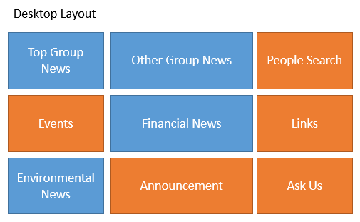
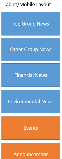
Sometimes customers like to reorder content from the desktop layout to tablet and mobile layout. Maybe having all the news visible first as one example. The desktop might have the following layout:

And the tablet/mobile layout like the following:

This can be accomplished using jQuery:
function swapDivs(){
    if ($1_7_2(window).width() < 1024) {
        $1_7_2('#globalgroupnews').insertBefore('#zoneleft1');
    }
}
Tablet/Phone Navigation Menu ☰
To implement a hamburger menu (☰) of your Top Menu, you can easily follow the guide How to Build a “Three Line” Drop-down Menu for a Responsive Website in jQuery. Basically, you follow the css rules above and add jQuery to add an extra class, toggle menu functions and remove inline styles when on tablet/mobile.
function hamburgerNavigation(){
if ($1_7_2(window).width() < 1024) {
$1_7_2("#zz1_TopNavigationMenu ul").addClass("js").before('<div id="menu">☰</div>');
$1_7_2("#menu").click(function(){
$1_7_2("#zz1_TopNavigationMenu ul").toggle();
});
$1_7_2(window).resize(function(){
if(window.innerWidth > 1023) {
$1_7_2("#zz1_TopNavigationMenu ul").removeAttr("style");
}
});
}
}
It's really not that much work to do, if you have the structure in order. But this is true in any redesign project, right :-)
Use Device Channels as Alternative
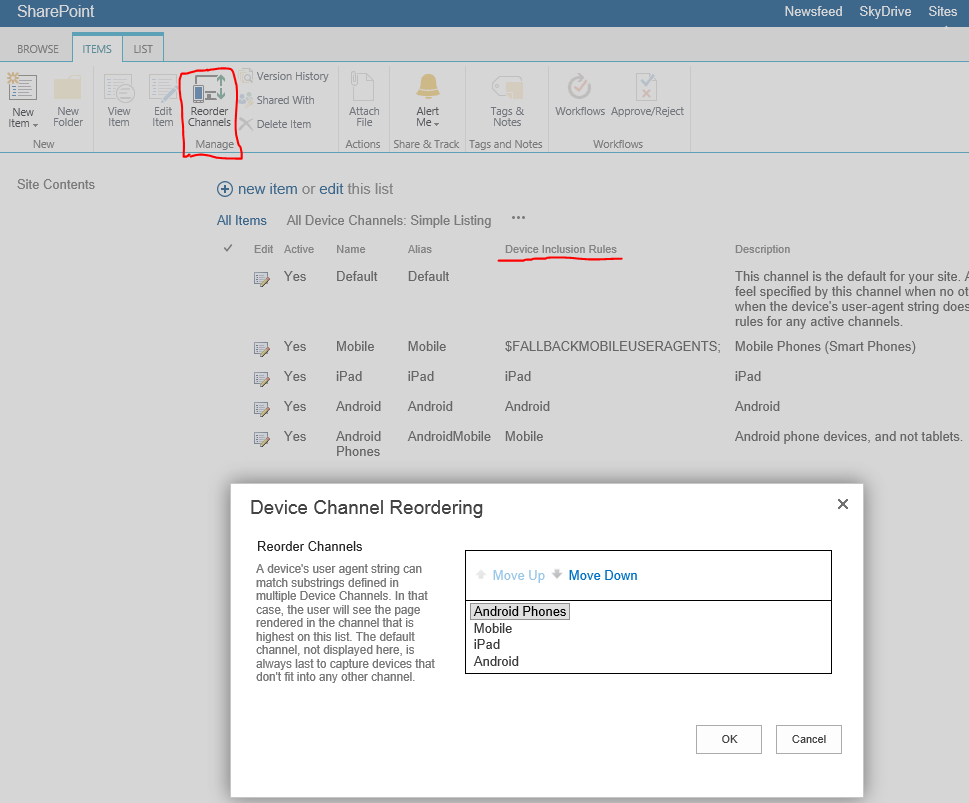
It also possible to use Device Channels to target different group of devecies. SharePoint reads the HTTP_USER_AGENT attribute to determine which device channel to use. Desktop uses the default and blank input of Device Inclusion Rules. Mobile ddevices is easy to target with the fallback of $FALLBACKMOBILEUSERAGENTS;. IPad is also ease to target, just use iPad as value of Device Incusion Rules. But Android Tablet is tough. If you type Android, you target all Android devices; tablets and phones since the HTTP_USER_AGENT of Android is similar to each other. Android phones uses Mobile in its HTTP_USER_AGENT which you need to add before Android targeting tablets. Otherwise you'll get the tablet device channel on Android phones as well.
When you test, you just add ?DeviceChannel=alias to see different views upon development. Be sure to test on real devices before deployment though.
http://sitecollection/site/pages/default.aspx
http://sitecollection/site/pages/default.aspx?DeviceChannel=ipad
http://sitecollection/site/pages/default.aspx?DeviceChannel=android
http://sitecollection/site/pages/default.aspx?DeviceChannel=mobile

How important is it to learn responsive design when you work as a SP developer?
We are moving toward tablet and mobile world, and user will expect their work applications to be responsive as well. So I'd say it is important to learn the basics, at the very least.
-
2
-
1
Sharepoint 2013 has the ability to enable "Mobile View" for a site. You can reference this link for more information on how to enable "mobile view"
Now a days, there are a lot of responsive frameworks and templates ready to use for Sharepoint. Bootstrap is one that comes to mind right a way, they actually have a Beta version ready for Sharepoint. However, there are many other ready to use templates readily available.
Click Here to read about Bootstrap for Sharepoint
Responsive design in general is becoming more and more important as technology evolves and focuses towards mobile and tablet users.
Now, the importance of responsive design in Sharepoint depends on how your Sharepoint site will be used. If it will be an internal tool, the importance depends directly with how the business will utilize the site as a tool.
If it is external, then it is significantly more important as user's will use various types of devices and screen resolutions to view your site.
Responsive design is nothing less than CSS.
