I have a number of "utility" columns in my SharePoint online list that are used by the JSON in other columns (for example, I need to check that the "Email1" column is populated before I make the "Send Email" button visible). I can't exclude them from the view, or the JSON doesn't seem to work. But the users don't usually need to see them, so I'd like to keep them out of the way as much as I can.
I've taken a couple of steps that help, like moving all of the utility fields to the far right-hand end of the view so that the ones people actually need are grouped first, with the others grouped after. But I'd also like to reduce the column widths, if possible, and ideally just hide the contents of each field unless the user takes an action to view it.
My temporary (ugly) hack was to use this to just make the font super-small:
{
  "$schema": "https://developer.microsoft.com/json-schemas/sp/v2/column-formatting.schema.json",
  "elmType": "div",
  "txtContent": "@currentField",
  "style": {
    "font-size": "2pt",
    "background-color": "lightgrey"
  }
}
So I can make the columns narrow:
Is there a way to either:
- Force the column width to be very narrow and prevent any text from wrapping (so we don't just trade wide for tall), even if it means the text isn't all visible in the field
- Hide the text and use an icon or something to only display the contents when the user takes an action to do that
Or is there something I'm missing in how I have my JSON coded... can I keep a column out of my view, but still refer to the contents of that column in the JSON for a column that is displayed? So, if my JSON formatting for my "Send Notification" column checks the value of the Recipients field in my screenshot, is there a way to make that work without having Recipients included in my view?
Updated Based on Answer from Ganesh Sanap Thanks to @Ganesh-Sanap for the link - it got me started. Using this code, I'm able to hide the field contents if it's null, and display the text "Hover to View" if there is content. Then, when the user hovers, the content of the field is displayed:
{
    "elmType": "div",
    "style": {
        "font-size": "12px"
    },
    "txtContent": "=if([$LogProofReceived]=='','','Hover to View')",
    "customCardProps": {
        "formatter": {
            "elmType": "div",
            "txtContent": "[$LogProofReceived]"
        },
        "openOnEvent": "hover",
        "directionalHint": "bottomCenter",
        "isBeakVisible": true,
        "beakStyle" : {
            "backgroundColor": "white"
        }
    }
}
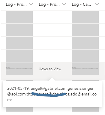
So functionally, that gets me what I asked for. The only problem is that even though I'm using the CustomCard for the hover, the display doesn't have the clean presentation of a card... it's just a long line of text:
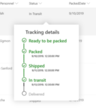
Even though I haven't stripped anything out of the sample code from Microsoft, mine doesn't have the nice clean look that theirs does in the example I used:
I've tried to use the CustomCard class in a couple of different places and manually defining the margin, but it hasn't changed the look. How can I format my hover to clean it up? I'd like to have it narrower and add some padding so the text doesn't run right up to the edge of the box.
Updated with Working Solution
Here's the final display:
It works exactly like I wanted: only displays if there's a value in the field, and then gives a clear and clean view of the field content if the user hovers on that field.
Here's the final code that I used... it was the word-break attribute that I was missing:
{
  "elmType": "div",
  "style": {
    "font-size": "12px"
  },
  "txtContent": "=if(@currentField=='','','Hover to View')",
  "customCardProps": {
    "formatter": {
      "elmType": "div",
      "txtContent": "@currentField",
      "style": {
        "width": "300px",
        "padding": "15px",
        "word-break": "break-all"
      }
    },
    "openOnEvent": "hover",
    "directionalHint": "bottomCenter",
    "isBeakVisible": true,
    "beakStyle": {
      "backgroundColor": "white"
    }
  }
}
Updated with Full Solution
With a bit more tweaking I was able to get the exact behaviour I wanted:
- The field checks to see if a hover should be displayed or not (if it's null, "No notifications", or "Skip" I don't want to show the hover)
- If no hover should be displayed, then the field is blank and there's no action when the user hovers (no field text, no hover, and no beak)
- If the hover should be displayed, then it appears when the user hovers over it
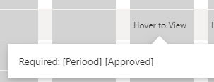
Here's how it looks:
And here's the final code:
 {
  "$schema": "https://developer.microsoft.com/json-schemas/sp/v2/column-formatting.schema.json",
  "elmType": "div",
  "style": {
    "font-size": "12px",
    "background-color": "lightgrey",
    "padding": "0px 0px 0px 5px"
  },
  "children": [
    {
      "elmType": "span",
      "style": {
        "display": "=if(indexOf(@currentField,'No notifications') !=-1,'none',if(indexOf(@currentField, 'Skip') !=-1, 'none','block'))"
      }
    },
    {
      "elmType": "div",
      "style": {
        "font-size": "12px",
        "display": "=if(indexOf(@currentField,'No notifications') !=-1, 'none', if(indexOf(@currentField, 'Skip') !=-1, 'none','block'))",
        "background-color": "lightgrey"
      },
      "txtContent": "=if(indexOf(@currentField,'No notifications') !=-1,'',if(indexOf(@currentField, 'Skip') !=-1, '','Hover to View'))",
      "customCardProps": {
        "formatter": {
          "elmType": "div",
          "txtContent": "@currentField",
          "style": {
            "width": "400px",
            "padding": "15px",
            "word-break": "break-all"
          }
        },
        "openOnEvent": "hover",
        "directionalHint": "bottomCenter",
        "isBeakVisible": true,
        "beakStyle": {
          "backgroundColor": "white"
        }
      }
    }
  ]
}


