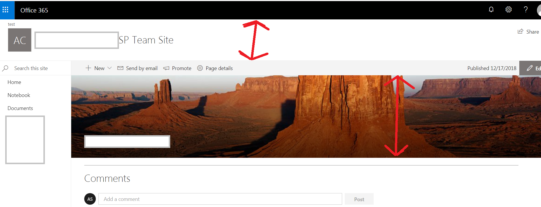
We have a classic online team site where we added a new modern page to it, and we set the modern page as the home page of the site. something as follow-
But currently we have, 2 wasted horizontal spaces (I highlighted them in red arrows inside my above picture) , as follow:-
the area where the logo and the site title is being rendered.
the home page banner image (containing the desert image).
so are there any approaches (built-in or using coding) , that can allow us to minimize the height of these 2 components or at-least one of them?

